

We’ve reached a fairly advanced stage of development with the Author Platform. We’re still at beta level, and work continues not quite round-the-clock but… almost. However, the volume of work being done doesn’t at this point result in immediate (and hopefully) attractive new features and functionality. What we’re mostly doing now is making the code more robust and more efficient.
One exception to this is the new Author Dashboard system. The old dashboard system was created and coded very early in the development process, and none of us have really been happy with its somewhat unfriendly and staid appearance. It was functional, but that’s all.
Well that’s about to change
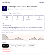
 Please meet your new Author Dashboard system: meant to provide a clean, clear and consistent user experience. Where the old dashboards spread information between different pages in a sometimes confusing way, the new system is meant to gather information in logical areas that feel intuitive to users.
In addition, different pages within the same dashboard are now represented as panels that you can access without needing to wait for a new page to load in your browser.
The new My Blog dashboard is the first in this system to be made public - just a few minutes ago. The major change authors may see will be the new blog post editor. The back-end adherence to an author’s chosen theme and custom colours has been dropped in favour of a consistent and easy-to-read visual design that should give authors a visual predictability that reduces distractions from writing new blog posts. We want the design to support you, not overcrowd you. It should make the whole process of blogging enjoyable and uplifting.
Authors still write a title, a subtitle, (optionally) a topic, and create the body of their blog posts using text, image, video, book and pullquote content blocks, but with a more pleasant user interface; for example, the buttons to add new content blocks don’t shift around but appear predictably before and after every existing block.
One new addition designed to make editing your blog post easier is the ability to ‘highlight’ specific blocks as either containing an open question, needing attention, or complete. These highlights are editor-visible only, and do not show to the reader of your posts. If you have any highlighted blocks that aren’t marked as complete when you publish your blog post, the editor will remind you of these and confirm that you really want to publish.
So if you’re interrupted while writing your blog post or decide you need to take a break, but have a specific block you need to complete, fact-check or edit - you can highlight it and save the draft. Later on, if you forgot about any of these tasks, clicking ‘publish’ will remind you of them first. So it’s an optional tool to make writing your blog posts become a less stressful and more enjoyable experience.
And for those of an analytical disposition… you’re in for a treat
As I say, the only platform function currently using the new Author Dashboard system is the Blog section. All other functions will adopt the new system over the next few days,
Let me know what you think.
One exception to this is the new Author Dashboard system. The old dashboard system was created and coded very early in the development process, and none of us have really been happy with its somewhat unfriendly and staid appearance. It was functional, but that’s all.
Well that’s about to change
Please meet your new Author Dashboard system: meant to provide a clean, clear and consistent user experience. Where the old dashboards spread information between different pages in a sometimes confusing way, the new system is meant to gather information in logical areas that feel intuitive to users.In addition, different pages within the same dashboard are now represented as panels that you can access without needing to wait for a new page to load in your browser.
The new My Blog dashboard is the first in this system to be made public - just a few minutes ago. The major change authors may see will be the new blog post editor. The back-end adherence to an author’s chosen theme and custom colours has been dropped in favour of a consistent and easy-to-read visual design that should give authors a visual predictability that reduces distractions from writing new blog posts. We want the design to support you, not overcrowd you. It should make the whole process of blogging enjoyable and uplifting.
Authors still write a title, a subtitle, (optionally) a topic, and create the body of their blog posts using text, image, video, book and pullquote content blocks, but with a more pleasant user interface; for example, the buttons to add new content blocks don’t shift around but appear predictably before and after every existing block.
One new addition designed to make editing your blog post easier is the ability to ‘highlight’ specific blocks as either containing an open question, needing attention, or complete. These highlights are editor-visible only, and do not show to the reader of your posts. If you have any highlighted blocks that aren’t marked as complete when you publish your blog post, the editor will remind you of these and confirm that you really want to publish.
So if you’re interrupted while writing your blog post or decide you need to take a break, but have a specific block you need to complete, fact-check or edit - you can highlight it and save the draft. Later on, if you forgot about any of these tasks, clicking ‘publish’ will remind you of them first. So it’s an optional tool to make writing your blog posts become a less stressful and more enjoyable experience.
And for those of an analytical disposition… you’re in for a treat
As I say, the only platform function currently using the new Author Dashboard system is the Blog section. All other functions will adopt the new system over the next few days,
Let me know what you think.
Last edited: